The 7 Key Traits of a Great Astrophotography Image

A great astrophotography image is very subjective. What some people would consider to be the ‘perfect’ image, is a complete mess to others. While there are some core aesthetics that I think most people can agree on (nobody likes a noisy image), other aspects have vastly different opinions depending on who you ask.
If I consider the image of the Western Veil Nebula shown below to be one of my best images yet, I think it would be helpful for beginners to understand why. You can learn from the key steps I took in the image acquisition and processing stages to create an astrophoto like this, or you can take your images in a different direction to tell the story of the object you want to tell.
I sent the following tweet to a massive list of astrophotographers to get their opinion on what makes a great astrophotography image. It is interesting to see what aspects of an astrophotography image are important to some and ruin the image for others.
This is (IMO) one of the best astrophotos I’ve ever taken. So I can get better, please tell me what you like/dislike about it: pic.twitter.com/n6XoGk2mwf
— 🔭AstroBackyard (@AstroBackyard) November 1, 2023
I encourage you to comment on this article with your ideas of what makes a great image, and if I have left anything important out. While I do have a lot of experience with deep-sky astrophotography, I have plenty of room to improve in terms of technique, and image processing.
Before we go any further, I have a few disclaimers. The image traits I mention below are highly subjective, and that is the point. You may disagree with my logic, and I welcome your constructive criticism in the comments.
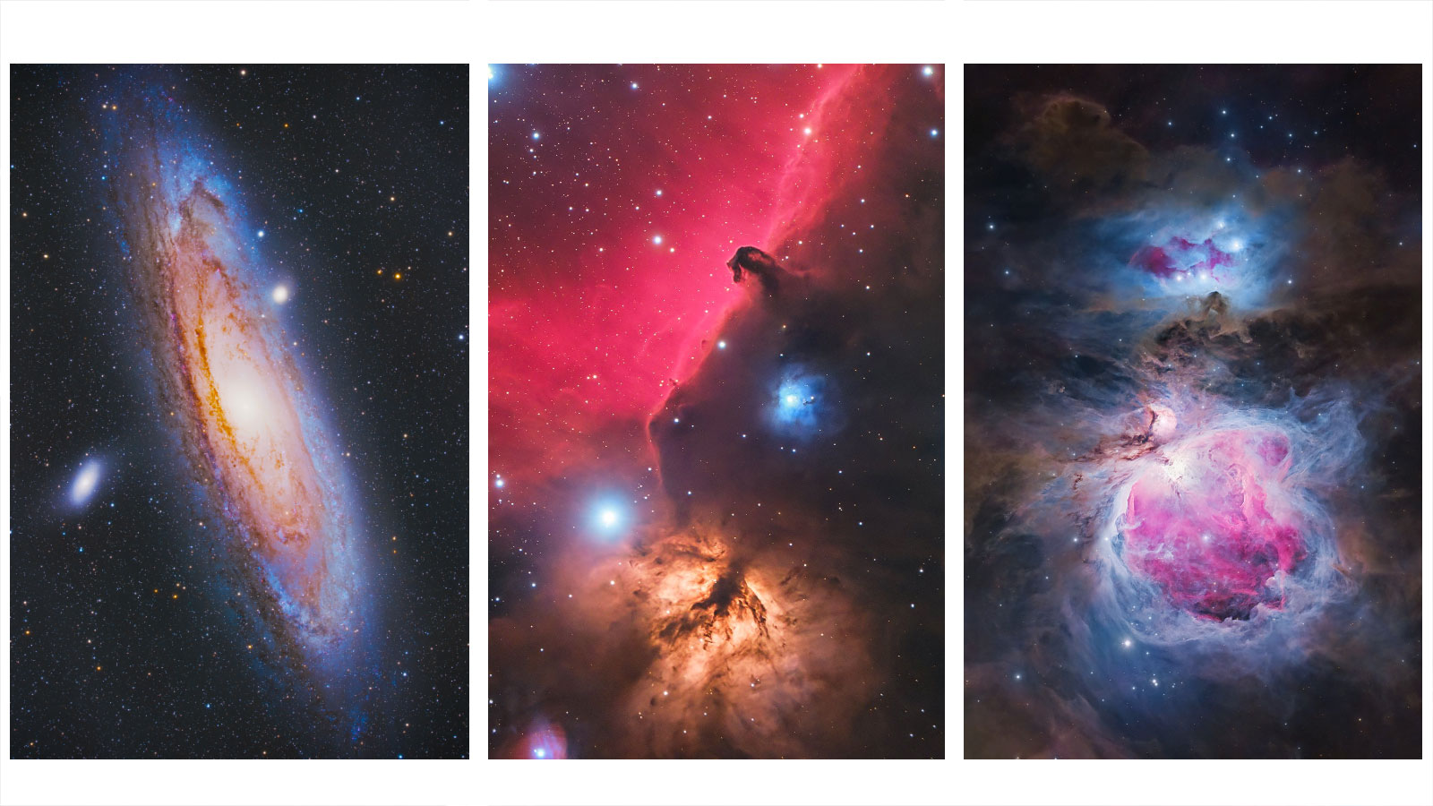
This article refers to deep-sky astrophotography images taken with a camera and telescope. While many of the same key strategies apply to Nightscape and Milky Way Photography, this article is geared toward pictures of nebulae and galaxies through a telescope.

The Western Veil Nebula. 5 Hours of Total Exposure Time. ZWO ASI2600MM Pro Camera with Narrowband Filters.
What Worked:
- The subject is well-framed
- The filters used isolate key wavelengths of light
- Depth is achieved by reducing star size
- The image is large and looks sharp at full resolution
- Dynamic color enhancements help create a dynamic scene
What Could Be Improved:
- More exposure time would help create a cleaner image
- The image is cropped from a larger field of view
- Many consider the image to be oversaturated
- Natural star colors are lost due to narrowband imaging
The 7 Traits of a Great Astrophotography Image
Based on my own experience (for over a decade), I have a few secrets to a great image. However, these are subjective traits that some people may not consider to be aesthetic. For example, I prefer to leave the stars in my final images (always), while others seem to enjoy the look of a completely starless astrophotography image.
One of the best places to review quality astrophotos is AstroBin. This website hosts all types of astrophotography images (deep-sky, planetary, nightscapes, etc.) from around the world, in stunning high-resolution. If you are looking for the best astrophotos in the world, it is hard to top the examples found in the image of the day section of AstroBin.
Based on my research and personal expertise, I have put together the following list of key factors that go into a great deep-sky astrophoto. You’ll notice that I have not included ‘difficulty of target’ on the list, which could be considered an important factor for many astrophotography competitions.
- Large, High-Resolution Image Size: The image looks great at its native size captured, and details can be enjoyed up close.
- Composition and Framing: The deep-sky object is thoughtfully framed to showcase its unique beauty.
- Overall Exposure Time (& Calibration): The image has enough overall integration to reveal delicate details without over-stretching and introducing excess noise.
- Star Quality and Size: The stars are round, small, and not overly ‘crunchy’ or soft.
- Overall Sharpness: The image is crisp and clear, but not jagged or over-sharpened.
- Saturation and Color Balance: The colors are punchy and not washed out. The highlights and shadows are not clipped.
- Depth and Contrast: The deep-sky object is dynamic, with areas of light and darkness. It does not appear ‘flat’.
Above: I prefer a colorful (perhaps oversaturated) look to my images. These images look great to me right now, but I know that in a few years, I will see several ways to improve the images using new techniques.
When Does an Image Become ‘Over-Processed’?
This is an interesting discussion. 5 years ago, I would have considered my latest photo of the Veil Nebula to be over-processed and unnatural looking. If you ever want to see how your personal image processing tastes evolve, just look back through your Instagram gallery. I bet you will see that your processing style gradually changes over time.
Or maybe your images go the other direction, and you now produce more scientifically accurate astrophotos of a higher quality. There are no rules to follow when astrophotography is a hobby that is meant to be enjoyed. I have found that when I experience times of burnout or lack of motivation, it’s always because I am not making progress that excites me.
Several people who saw my latest version of the Veil Nebula considered it to be oversaturated and over-processed. I do not disagree with them, yet I was very intentional with the level of color and detail of this photo. By next month, I am sure I will have a new opinion on the quality of this image.

Above: The top version of the image has a more natural ‘out of the camera’ look, while the bottom version has been stretched and saturated much more.
Finding Inspiration from Others
All of my deep-sky astrophotography projects start the same way. I see a stunning deep-sky image shared online and am inspired to create my own version of the target using my telescope equipment in the backyard. The equipment and processing tools used are often very different than my inspiration image, but this helps me put my own unique spin on the target.
If you also operate this way, make sure you understand the amount of time, energy, and money that went into the image. If an image was taken through a 24″ telescope from a dark, remote observatory, you may be a little underwhelmed with how to object looks through your RedCat 51.
However, you can still learn from the processing style, framing, and color palette of your favorite astrophotographer and apply those techniques to your image. My latest version of the Veil Nebula was heavily influenced by the incredible version shared by Ken Crawford many years ago. To me, this is ‘what the Veil should look like’. This phrase always gives me a chuckle when I hear astrophotographers debating it in forums or the comments section.
No matter which image processing software you use, I hope you keep these 7 key traits in mind as you edit your images. As long as you feel that your images are gradually improving over time, you will be motivated to keep going.
I agree with your concept Trevor. It is in the eye of the beholder rite.
Keep up the good work. Been folowing you for a few years. Have learend a lot.
Bill
Thanks Bill! I am glad to share what I have learned. Thankfully, only a portion of it is “what NOT to do” lol 🙂
I lean toward AP for beauty. I dont want beauty overidden by over saturation. The OV shows more detail but at what cost??? What is the purpose you want fulfilled in your astrophoto. research (not likely), True beauty of the object (to me more likely). I like to draw the line early for creative post processing.
Great insight, Jim. I think the key is “what is the purpose you want fulfilled” as you said. Everyone has a slightly different answer here, and I think that drives the varying treatments of images. I’m just glad they don’t all look the same!
you are the rock star of Astrophotography. I heed your suggestions and education with the greatest of confidence and trust
Looking at APODs it would seem the preference is for vibrant, high saturation, high contrast images. Nothing wrong with that but as a personal like I prefer a bit more “grayness” to the background of space instead of black. It seems to be a bit closer to what you might experience if one had 3 color image intensifying eyes and a 1 meter scope in a Bortle 1 sky. If only…
Both great images Trevor, just for different reasons. I had a look at my Veil from a couple of months ago and it sits somewhere in between yours, though probably with more stars than either.
My aim is to ‘capture the beauty, so that I let out a little sigh of appreciation at yhe universe’ when I look at what I’ve got
(That’s a pretty esoteric description though.)
I’ve been following your YouTube work for a few years, keep up the great work!
Trevor
Thank you for the great articles over recent years- I have learned so much.
In my opinion final image depends on what is the original objective of the photo.
Is it for some scientific research project or to please us and amaze our friends and family and introduce them to the wonders of the universe.
I believe it’s similar to a painting – some artists produce a picture that is as good as most photos , others are are impressionistic . Who would complain that Monets art was not up to standard as it did not reflect their perception of reality.
The more I study the technical aspects of photography, sensors, Bayer matrices and the Hubble palette ect, the more I realise its all an approximation of reality any way.
I think we should just concentrate on the wonders of the universe , and represent it in a form that makes us happy and keeps us involved in this great hobby.
Thanks again and keep up the great articles
For the record , my images vary from what might be considered over processed to very little processing- it depends on the image and my mood at the time.
Keep up the great articles
David
Australia
David
For me, these images are interpretations, just like music or theater, or any other art form that can be manipulated in a subjective way. They are to be savored one at a time, not in comparison with others, but each on its own merit.
I have lots of recordings of Rachmaninov’s Third Piano Concerto, each a unique result of the performers choices. I enjoy all of them. And the more I listen, the more I appreciate the differences. I can, and do, view different versions of astronomical objects the same way, different interpretations highlighting different qualities of the object.
I like the image overall, but find its vertical orientation to be ‘weird’ (it seems like something that should be horizontal for some reason.
Any chance you’re considering a presence on a platform other than Twitter? I won’t give Elon the satisfaction of having me as a customer any longer.
This was very timely for me, Trevor, since I’ve been struggling with ‘what looks good’ to others and, perhaps more importantly, what gets them excited about our wonderful hobby and the wonders hidden in the night skies. This is a fantastic set of guidelines! Thank you.
Perhaps I’ve been confounding things by trying to come up with a personal ‘unifying’ theory about what looks good, and have been frustrated to no end. If I go one way, comments indicate I should have done something else. If I try to do that something else down the road, the comments indicate I should have gone a different way still.
That’s not to say I don’t appreciate constructive criticism! Lord knows I have a very long way to go and an enormous amount to learn, and I’m very happy for input and critique. After all, we publish images for others to look at, and their comments are invaluable to that end.
But…I think my frustration has been largely because ‘what looks good’ to others (as judged by ‘likes’ and comments) is largely dependent on where images are posted, what that particular audience appreciates, and how they view and interpret the images. An Instagram audience is going to look for one set of attributes (maybe colorful, unique, relatable), an Astrobin audience a different set (maybe difficulty, processing skill, clarity and contrast), and a local astronomical society audience perhaps and entirely different set (perhaps more scientific accuracy)! I’m finally realizing that.
In the end, I’ve really got to please myself, I think, and do what feels right to me — at the time and within the constraints imposed by my (limited) equipment and (very limited) processing skills. If my tomorrow self is better than my today self, and if I am still excited by what I tease out of my images, I should be very happy (as you alluded to).
Again, this was a terrific post, Trevor! Thanks once again for this and for always being willing to share the ups as well as the downs of this amazing, frustrating, expensive — but at times very rewarding — hobby.
Greg
I agree with your 7 traits. My aim in astrophotography is to produce aesthetically pleasing (to my taste) pictures, with colors matching reality. For H alpha nebula, consisting of the characteristic 656.28nm narrow line emission, this means to choose its best match in the sRBG-color space at R=255, G=000, B=082 (max intensity). Having set this, I frequently can’t decide and save 2 or more versions with different saturation, contrast or star size.
Hi Trevor,
I’m a big fan of your work 😊
I totally agree that this is a subjective exercise of interpreting data in a way that pleases the photographer.
As in the other comments here, you can draw good parallels with art and music. The creative interpretation is one aspect I enjoy probably the most.
From my own perspective, I am going the other way !……i am enjoying a more subtle, less ‘deep’ capture…..my most recent and one of my ‘best’ images was a tiny 1 hour on M33 ! (Not from choice but weather)….I am also getting lovely results from my trusty old canon 6d that are more pleasing, to me, than my expensive mono camera !
It’s a strange and wonderful universe eh 🤷♂️😊
Cheers and keep up the great work,
Andy
Your point about our changing preferences rings true. I’ve been at it about 4 years now, and seen that, while I still have a lower threshold of how much saturation I like, it definitely has increased since I started. And I do agree that studying large numbers of images on Astrobin (and CN forums) has likewise probably influenced me. And NASA, for their part, has contributed to the situation by releasing gorgeous views from the Hubble and JWST. We really are astro artists, and as such, bring a fair bit of subjectivity to our craft.